The U.S. Mint has made some really gorgeous coins over the last few decades… and some incredibly ugly coins. Let’s look at the ugliest coins ever made by the U.S. Mint.
Some of these are my opinion, and others were decided by popular opinion. If you feel like a coin deserves a spot on this list, post a comment or reach out on my Contact Page.
7.) JFK Presidential Dollar (2015)

We know the U.S. Mint can make a better JFK coin, because they did it on the Kennedy half dollar. All the presidential dollar coins are boring, but this one is on the verge of unattractive.
Not the ugliest coin on this list, but my biggest issue is how sad this coin looks. JFK looking down does not give him a presidential look, but more of a forlorn, forgotten look. Coins are all about symbolism, and I wish this coin had a more hopeful aspect to it.
6.) Cincinnati Half Dollar (1936)

BORING!
This must have been done by one of the laziest engravers at the U.S. Mint. There are no details on lady liberty. She looks very blobby.
Besides the lack of detail, the ugliest part of this coin is Lady Liberty’s neck. Are you okay Miss Liberty? Necks are not supposed to bend like that.
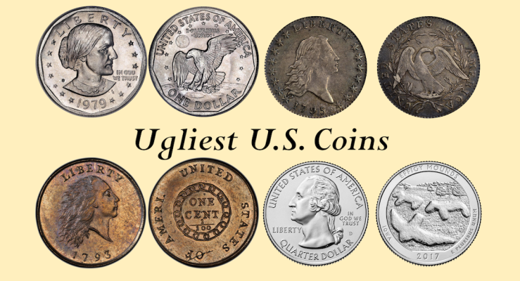
5.) Flowing Hair Half Dollar and Dime (1794-1795)

I can’t judge this coin too harshly, as it is one of the first coins made by the U.S. Mint, I’m sure they were still working out the kinks in the design process.
This coin has a some intricate detailing, but several design choices that are unappealing. First, Lady Liberty’s hairline looks strange to me. Perhaps she is suffering from early balding?
My biggest issue with this design is with the Eagle. This eagle looks more like a starving plucked chicken or a vulture than a powerful eagle. The head is way too small.
4.) Three Cent Silver (1851-1873)
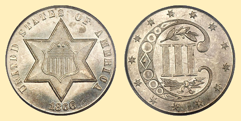
Gosh, this coin is weird. It doesn’t resemble any other U.S. coinage, so I give the Mint points for bravery here.
The obverse reminds me of a sheriffs badge, and the reverse reminds me of a witches spell book. Most of the imagery makes sense, except for the large “C” on the reverse which I have yet to see an explanation for.
This coin was not popular in its time, nor is it popular for coin collectors today.
3.) Effigy Mounds Quarter (2017)

The Effigy Mounds Quarter is here due to public opinion, more than my own. Many coin collectors don’t like this quarter because the effigy mounds look like amorphous blobs in person.
In the picture above we can clearly see the blobs resemble animals, however in person the quarters are not as attractive once they’ve worn even slightly.
Personally, I like the effigy mounds quarter, I think the use of blank space is interesting and eye-catching, but I am in the minority with that opinion.
2.) Chain Cent (1793)

The Chain Cent coin gives me the heebie-jeebies. Something is very scary about the depiction of Lady Liberty in the Chain Cent. She looks more like a body-less ghost floating around a haunted mansion than a symbol of strength.
The reverse is equally unappealing. I assume the chains are meant to signify unity, but it reads are more restricting and dystopian.
The shortening of “AMERICA” to “AMERI.” is also a strange choice, there is so much blank space on the reverse, there was easily room for the whole word.
I did not give this coin the number one spot on the list simply because it is a very early U.S. coinage.
1.) Susan B. Anthony Dollar Coin (1979-1999)

So much went wrong in designing the Susan B. Anthony dollar coin. There was interference from lobbyists, outdated laws, and public interest groups all working together to make this one of the ugliest U.S. coins.
On its own, this coin has some really attractive elements. The eagle landing on the moon is one of my favorite coin reverses. But what does the moon landing have to do with Susan B. Anthony? Nothing.
The U.S. Mint wanted to design a coin that was not a perfect square, but vending machine lobbyists interfered because it would be more difficult to use in a vending machine. Instead of scrapping that idea, the mint left in the hexagonal edges.
I know several people don’t like this coin because they think Susan B. Anthony looks too ugly, and that is a silly argument. We don’t put people on coins because they are attractive, we put them on our coinage because they were influential and inspiring. Abraham Lincoln is on the penny, but he was widely regarded as being unattractive for his time.
I like this coin for the lore around why it has so many different elements, but ultimately it is the ugliest coin due to the lack of a coherent theme.
What did you think about this list? Anything you would have changed? Share a comment below!

[…] one of the most interesting pieces of US coinage. This coin is widely regarded as being one of the least attractive coins ever made by the U.S. Mint, but along the way there were many times the design could have been fixed but was […]
LikeLiked by 1 person
[…] may be ironic coming from the person who has written articles condemning colorized coins and ranking ugly coins, but the most important part of your collection is making sure you enjoy every […]
LikeLiked by 1 person
I think it depends on how you take the picture too — here is by far the ugliest, most disgusting coin I’ve personally scanned: https://www.easyzoom.com/image/240374
LikeLike
Hahaha! That is a very haunted James Madison!
LikeLike
I think the C stand for cent in the 3 cent coin. Like, it has a III and then a C. 3 cent.
LikeLike
🤯🤯🤯 It feels silly that “cent” never crossed my mind.
LikeLike
this is even more ugly https://upload.wikimedia.org/wikipedia/commons/6/61/2017_American_Liberty_225th_Anniversary_Union_Obverse.jpg
LikeLike
Awh, I like that design a lot. What problems do you have with it?
LikeLike
ya know, that ugly black liberty
LikeLike
what about making an article about the best designs as well
LikeLike
That is a great idea! What would be your favorite design? Mercury dime would be in my top 3 for sure.
LikeLike
The current “zombie eyes” Jefferson nickel is one I very much dislike.
The void to his right also is not pleasing to my eye. It is like when someone plays a piano scale and hits all but the last note.
LikeLike
[…] Design: Coin collectors are interested in the design of a coin. They want to know what images and symbols are on the coin and what they represent. Coins with interesting or attractive designs are generally more valuable than coins with plain or unappealing designs. (Read: Top 7 Ugliest Coins in US History) […]
LikeLike
Three cent silver reminds me of a chucky cheese coin hahaha 🙂
LikeLiked by 1 person
Personally I think the 3 cent coin is striking and its one of my favs. Maybe BECAUSE it’s so different/odd
LikeLiked by 1 person
The fact isnt that Susan B. Anthony looks “ugly” on the coin but, she looks like the witch from ‘the Wizard of Oz’. Be careful not to spill water on the coin or it will melt and lament “what a worrrrrld”
LikeLike
And the fact isn’t Susan B. Anthony is ‘ugly’ but, that she looks like the witch from “the Wizard of Oz”
LikeLike
Hey moderator, erase this and the 2nd wizard comment cuz the first DID go thru haha… good article btw… needs a follow up with world coins
LikeLike
Haha, thank you! I don’t even know where I would start with world coins!
LikeLike